

Project
Cocomoco Bakery & Coffee
Year
2025
Cocomoco Bakery & Coffee
Year
2025
Visual identity design for Cocomoco bakery & coffee. A home-grown bakery based in Surabaya - Indonesia, offering a modern variety of breads, made with finest ingredients. Started in a residential area, making Cocomoco well known for their homey atmosphere. It is naturally creating a positioning as a “friendly neighbourhood bakery”.
To prepare a bigger expansion in the future, a comprehensive
brand system need to be created. We enhance the visual, creating whole graphic system, into re-positioning imagery without leaving the brand roots.
To prepare a bigger expansion in the future, a comprehensive
brand system need to be created. We enhance the visual, creating whole graphic system, into re-positioning imagery without leaving the brand roots.
The Logo
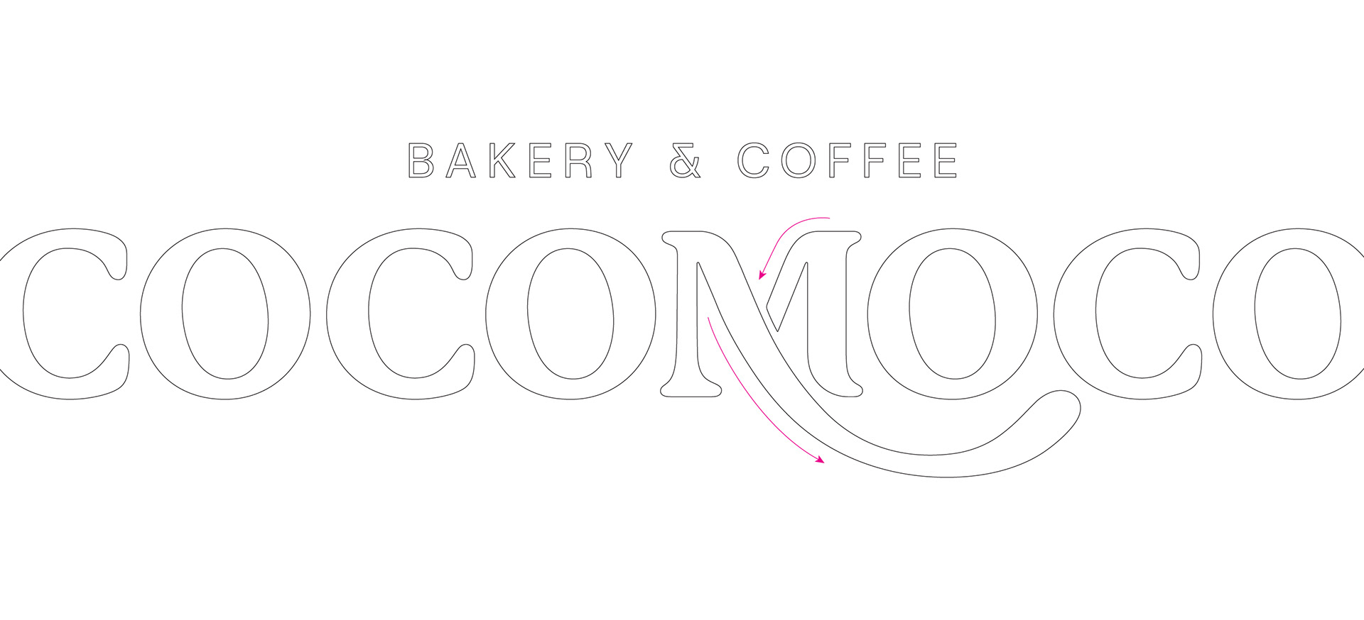
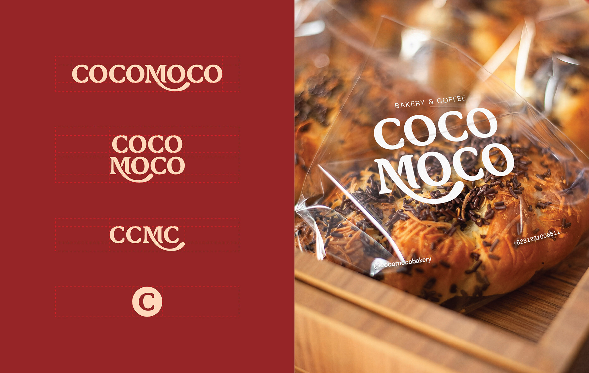
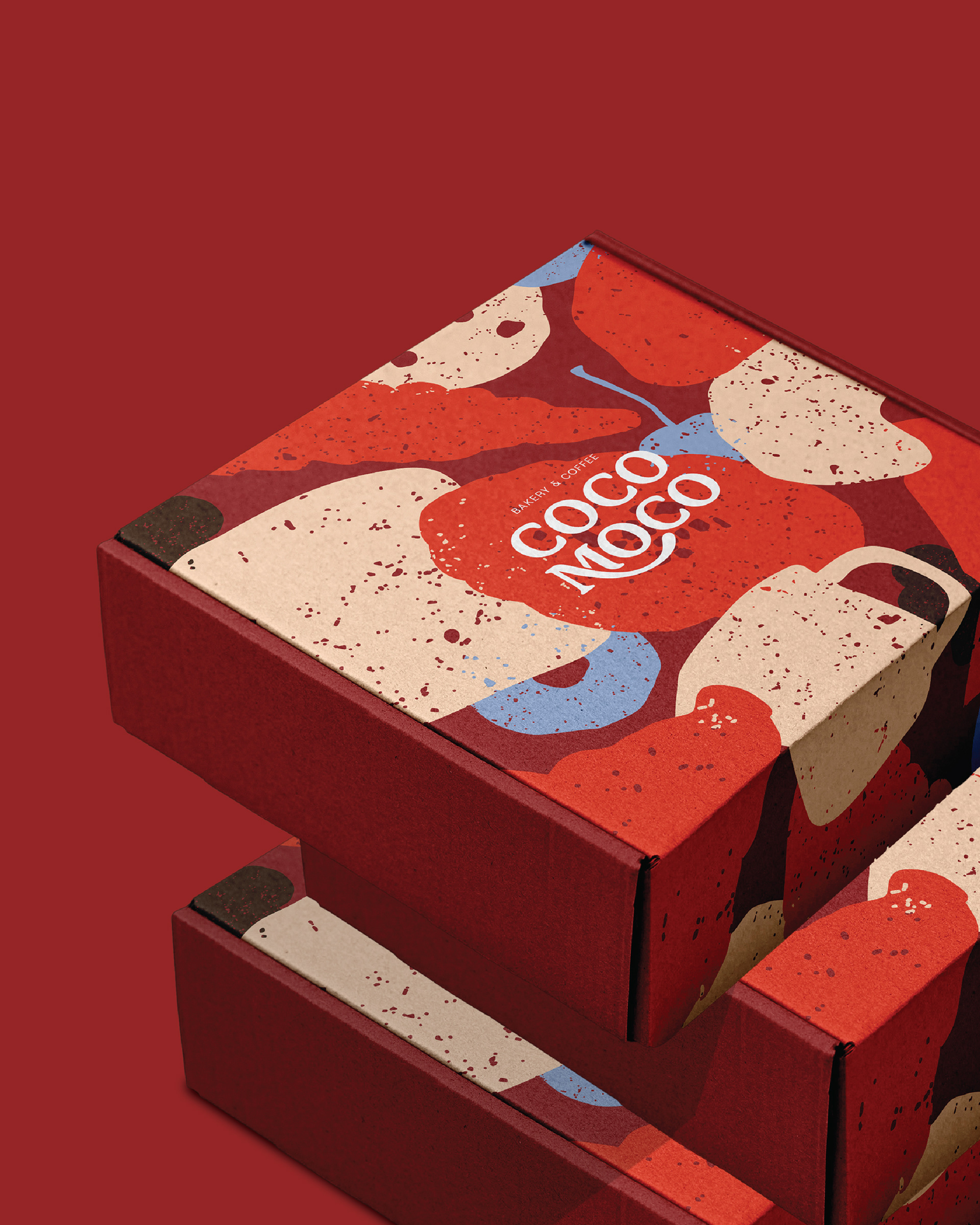
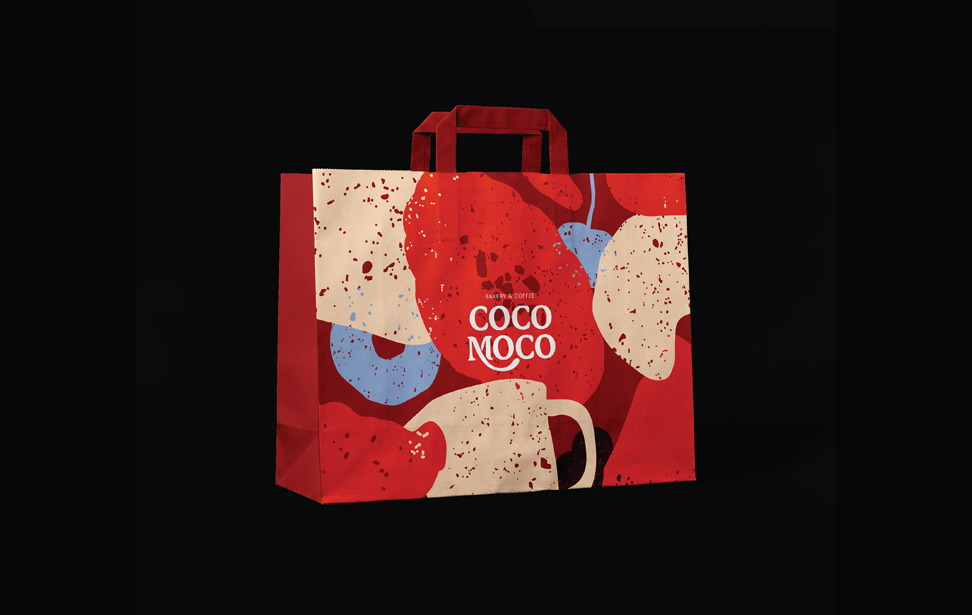
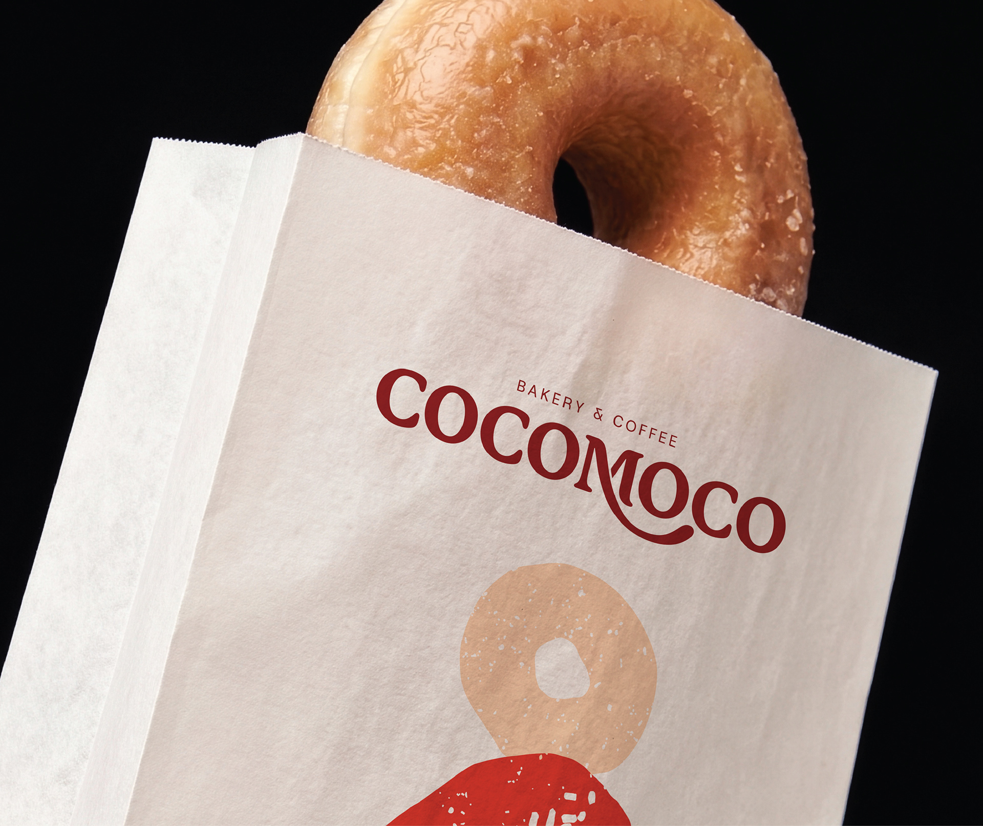
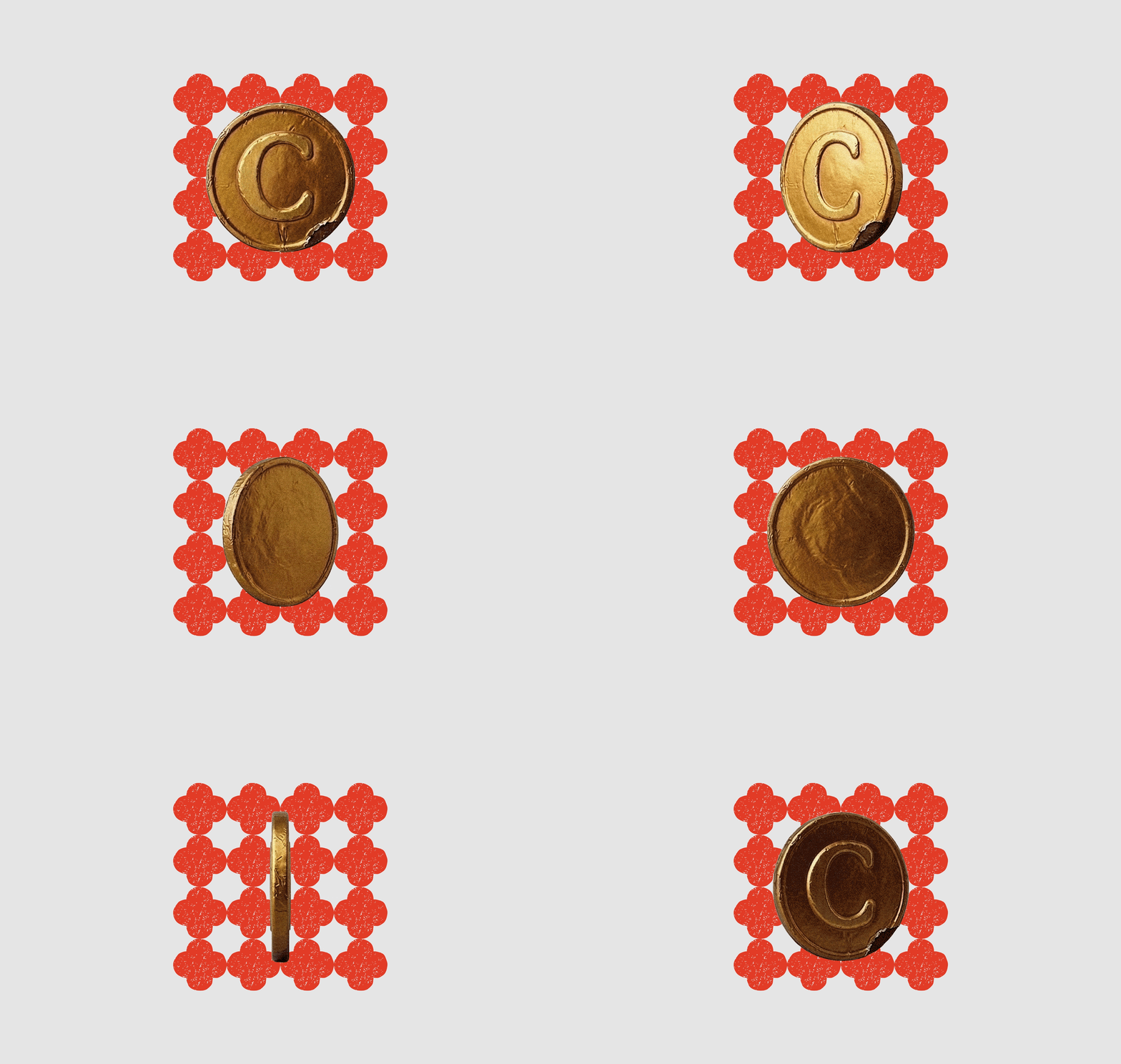
We develop an iconic character on the mid letter from Cocomoco logotype. The one and only different shape, M letter of Cocomoco crafted with the philosophy of the crisscross symbol, a metaphor for mutual support in a business. As a part of a hope, we want the business expanding, and grow bigger.

Supergraphic
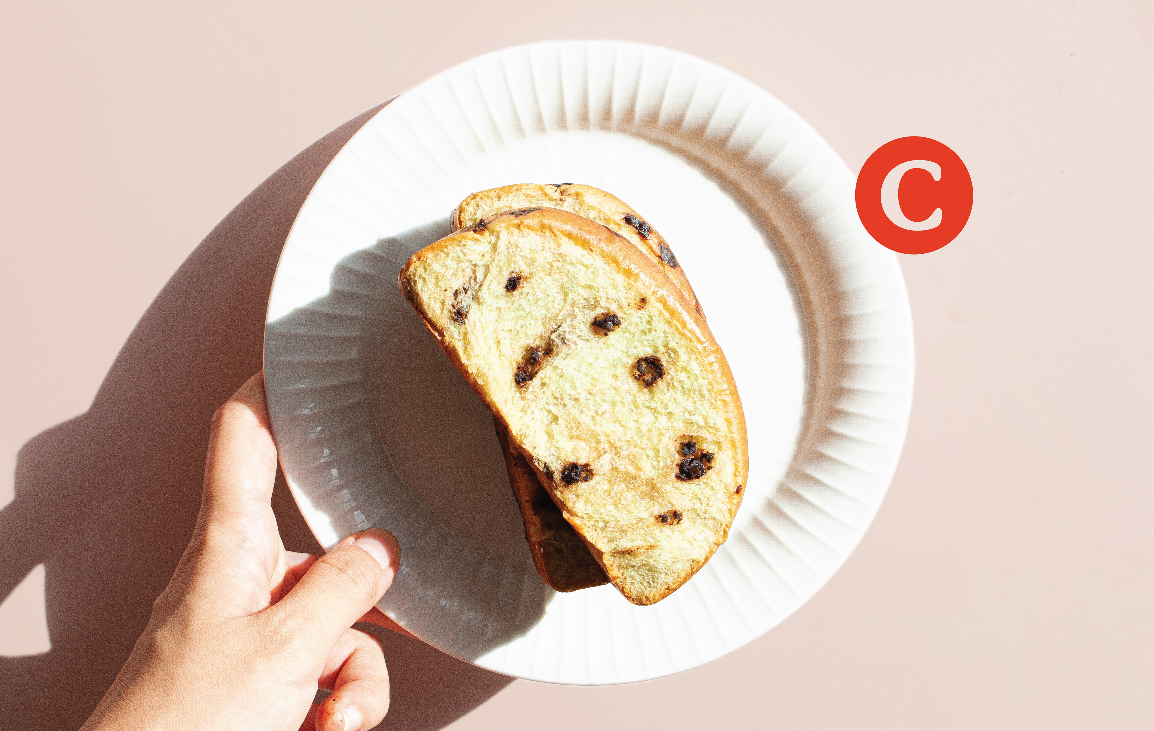
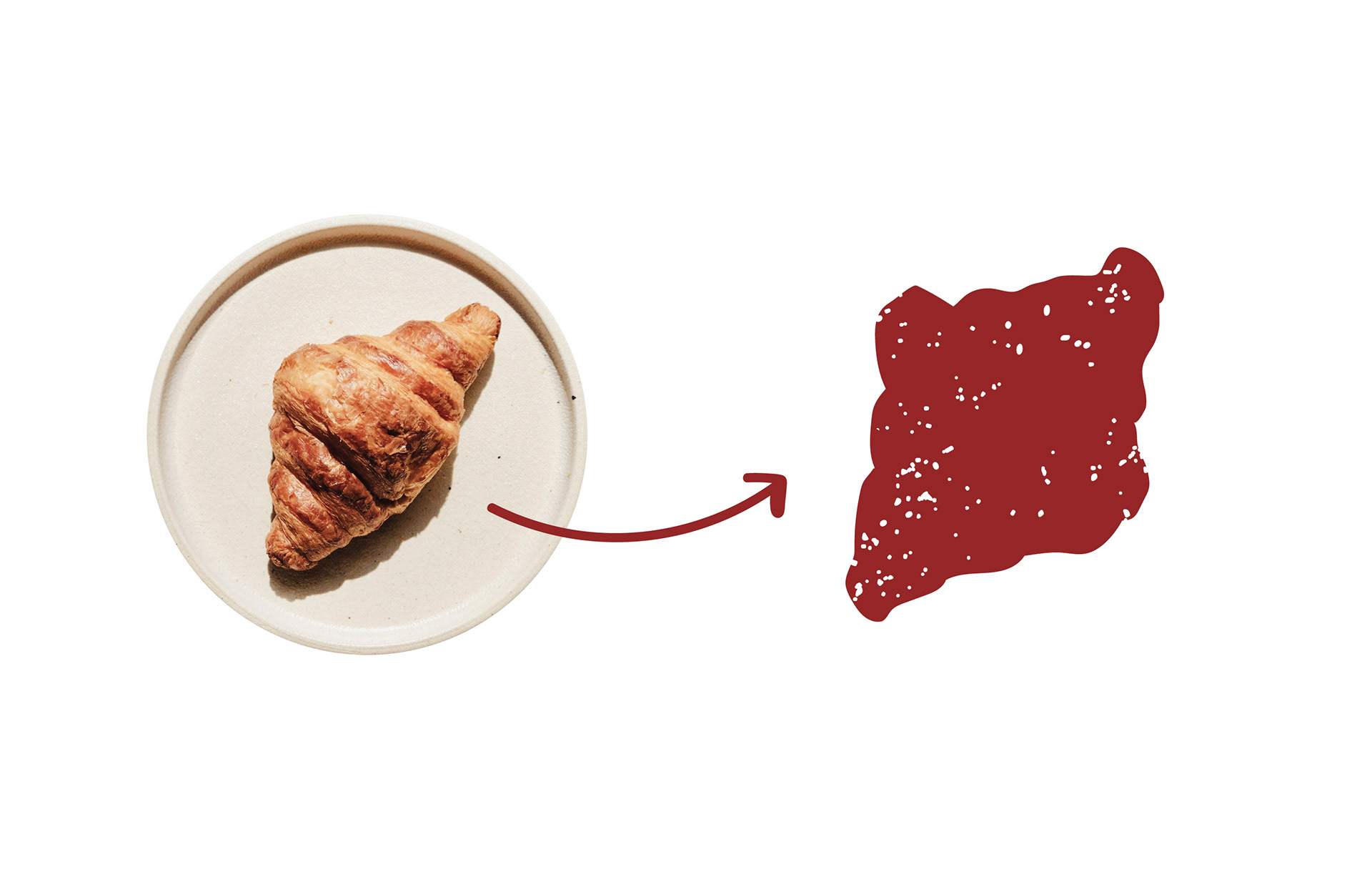
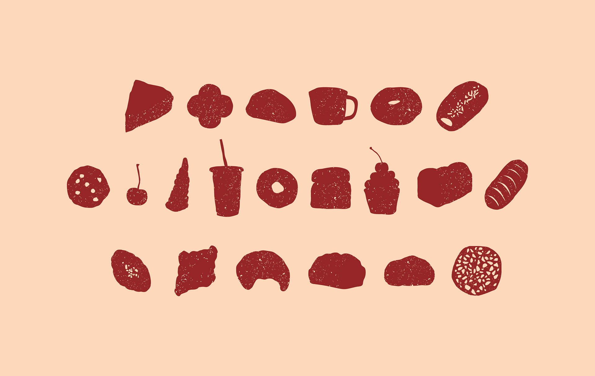
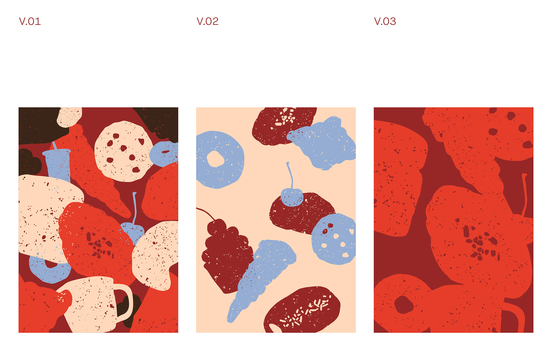
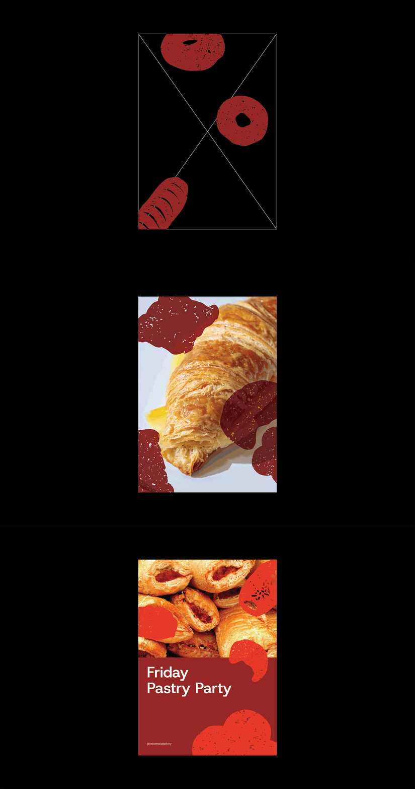
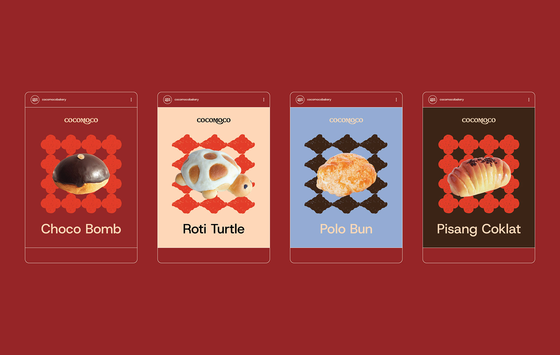
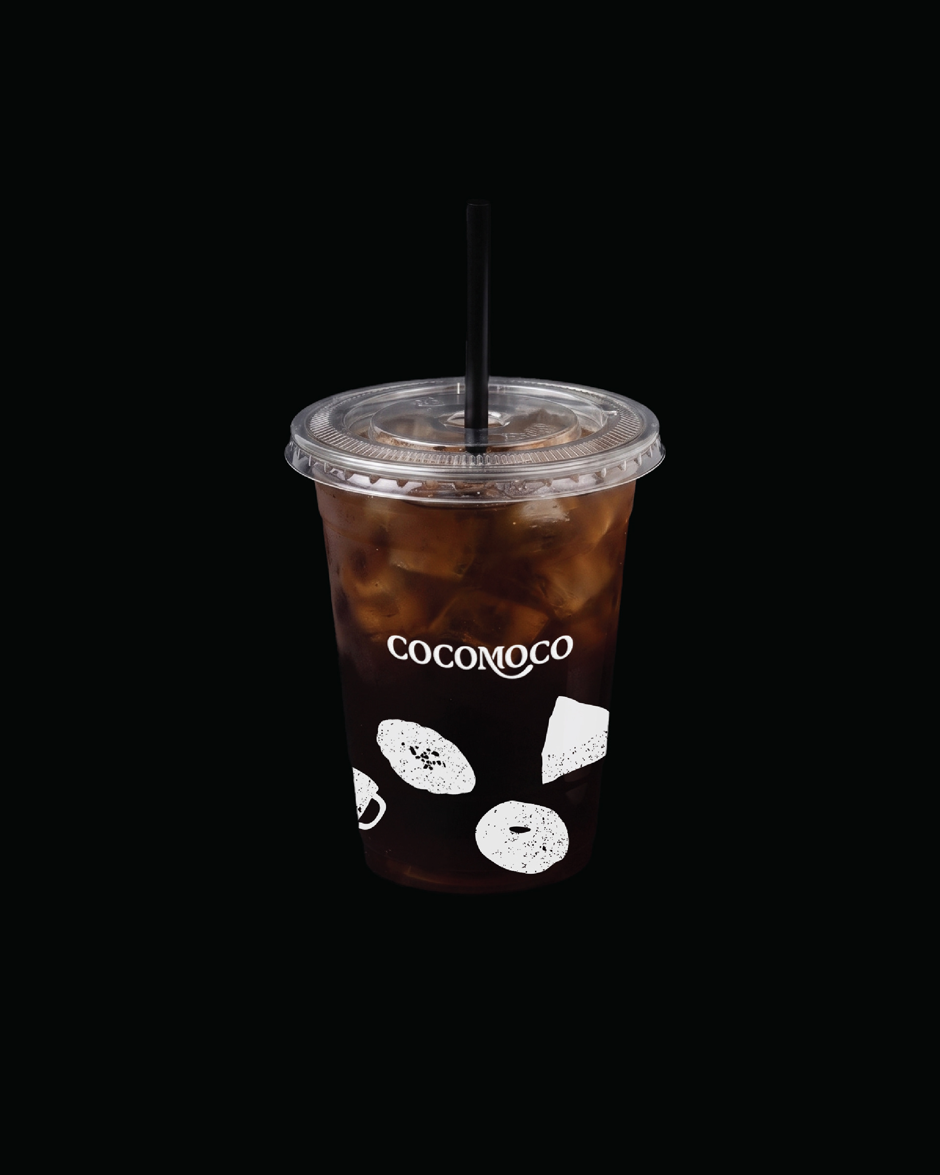
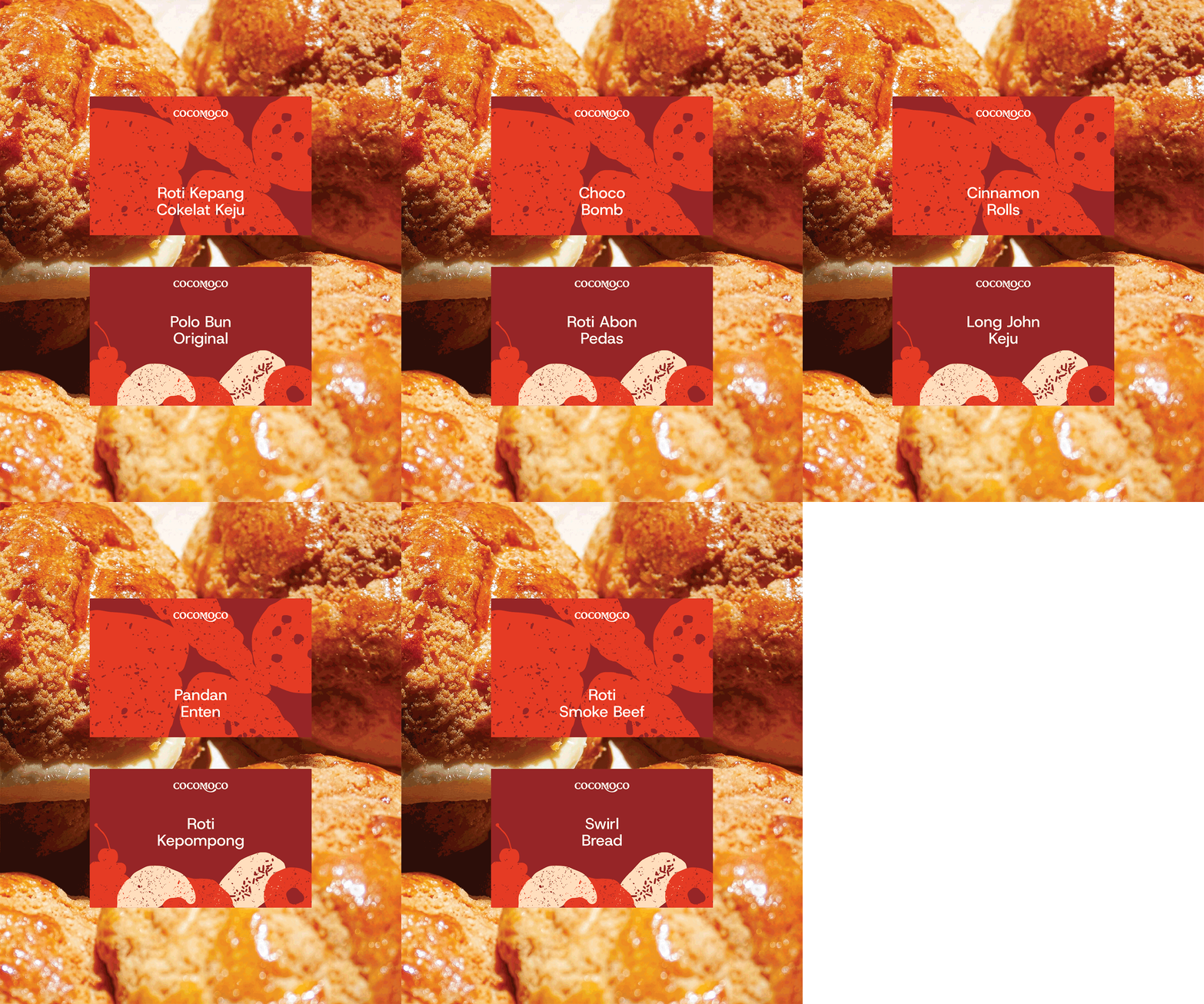
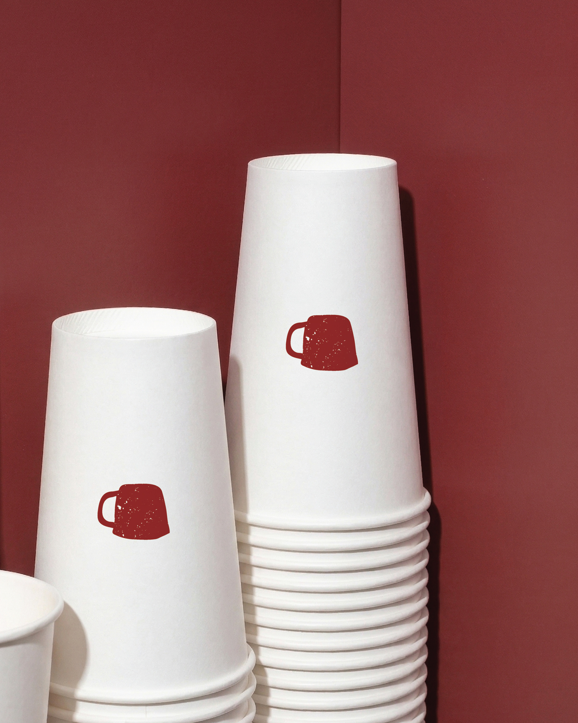
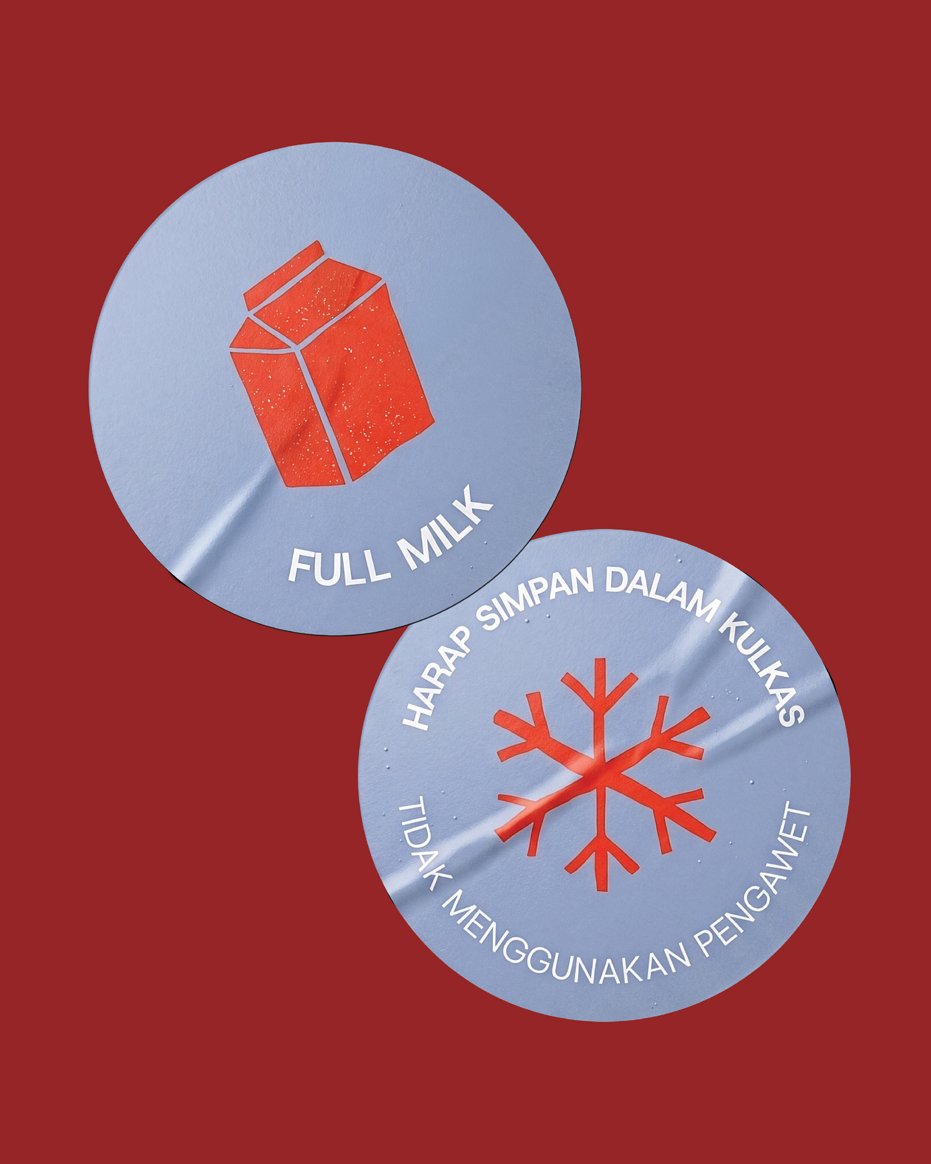
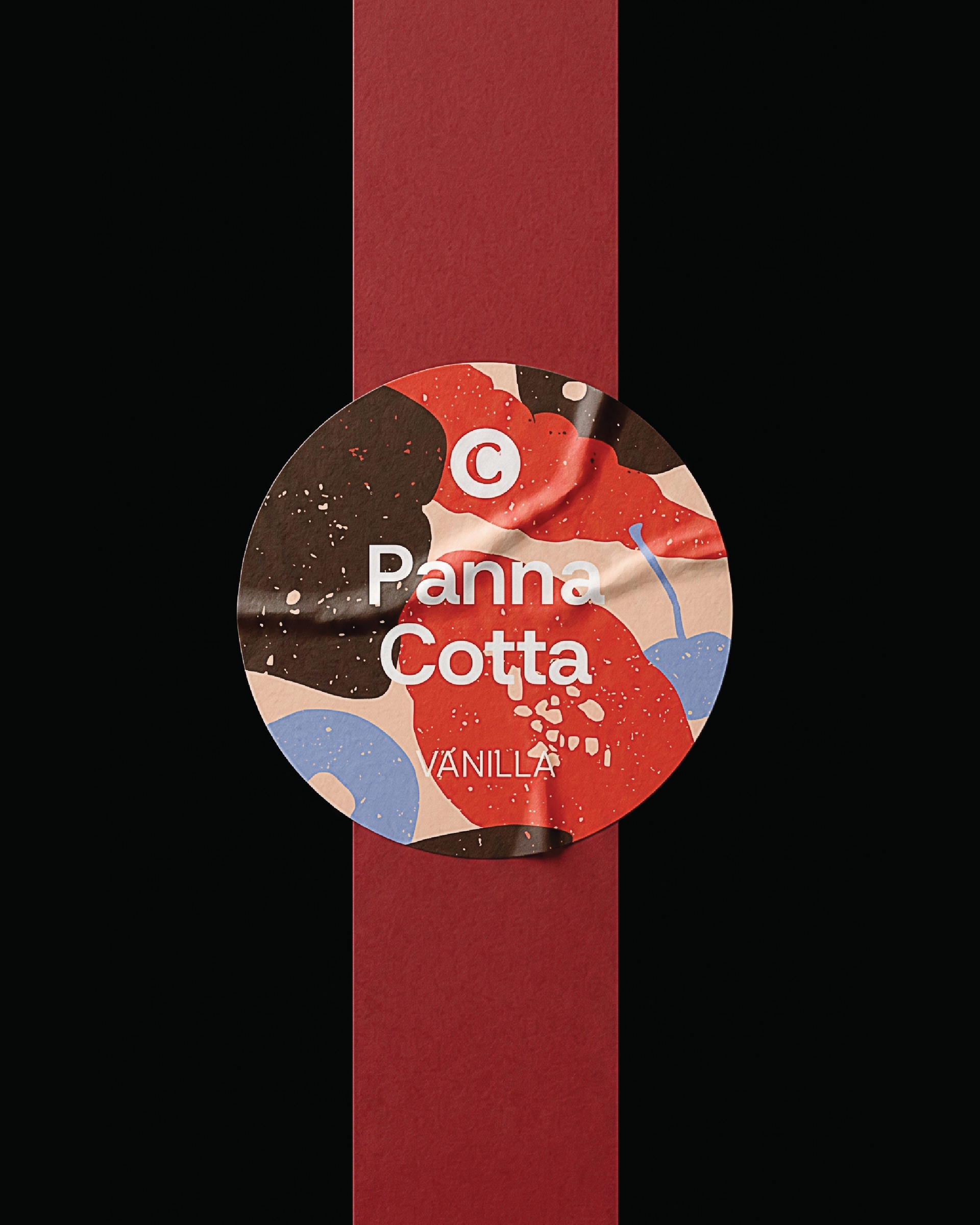
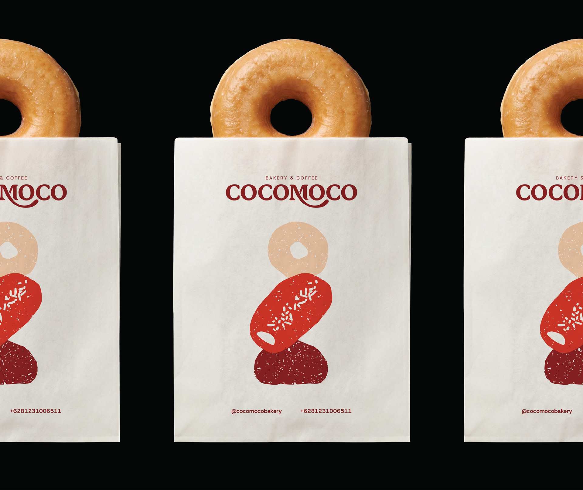
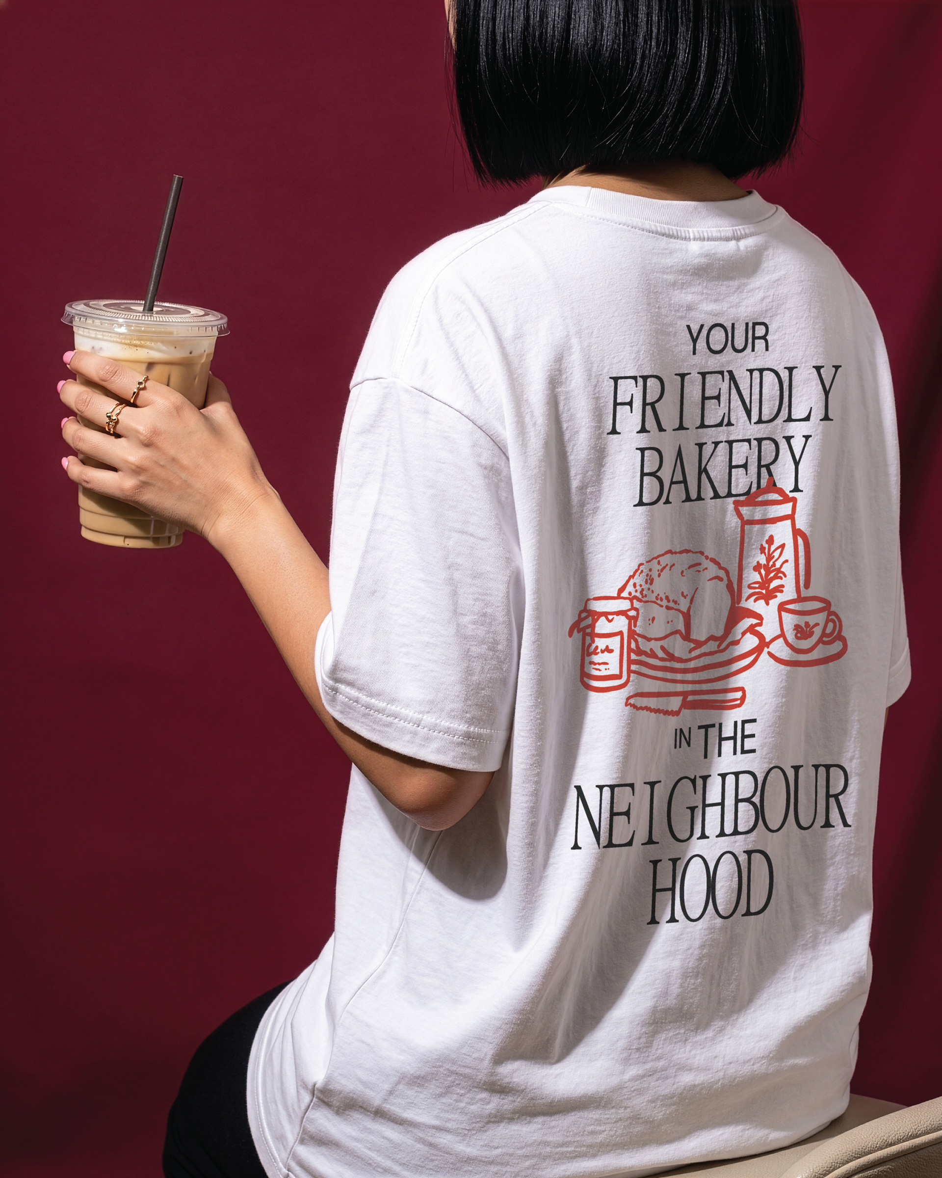
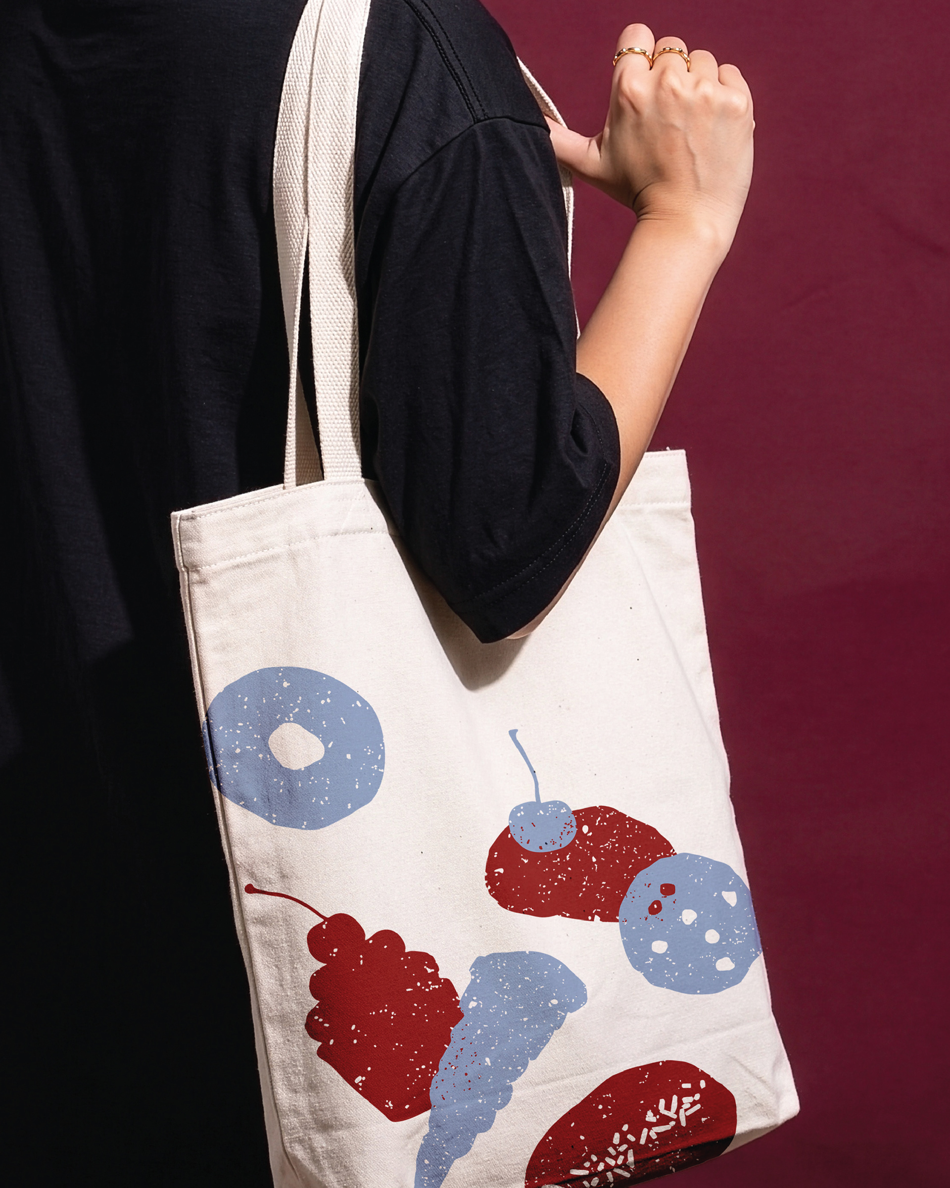
Designed to evoke a sense of home, the supergraphic embraces warmth and comfort while reflecting the handmade nature of the bakery. This concept is reinforced through hand-drawn silhouettes of the bakery's signature products, adding a human touch and expressing genuine craftsmanship.
Supporting Elements (Secondary Pattern)
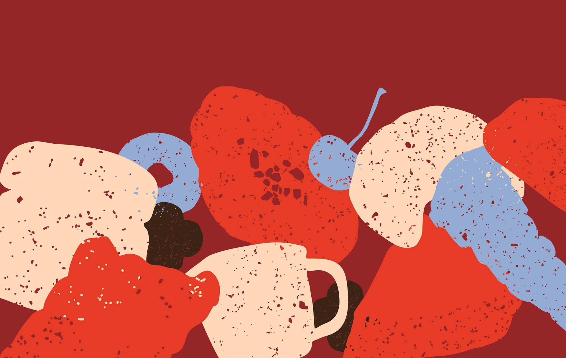
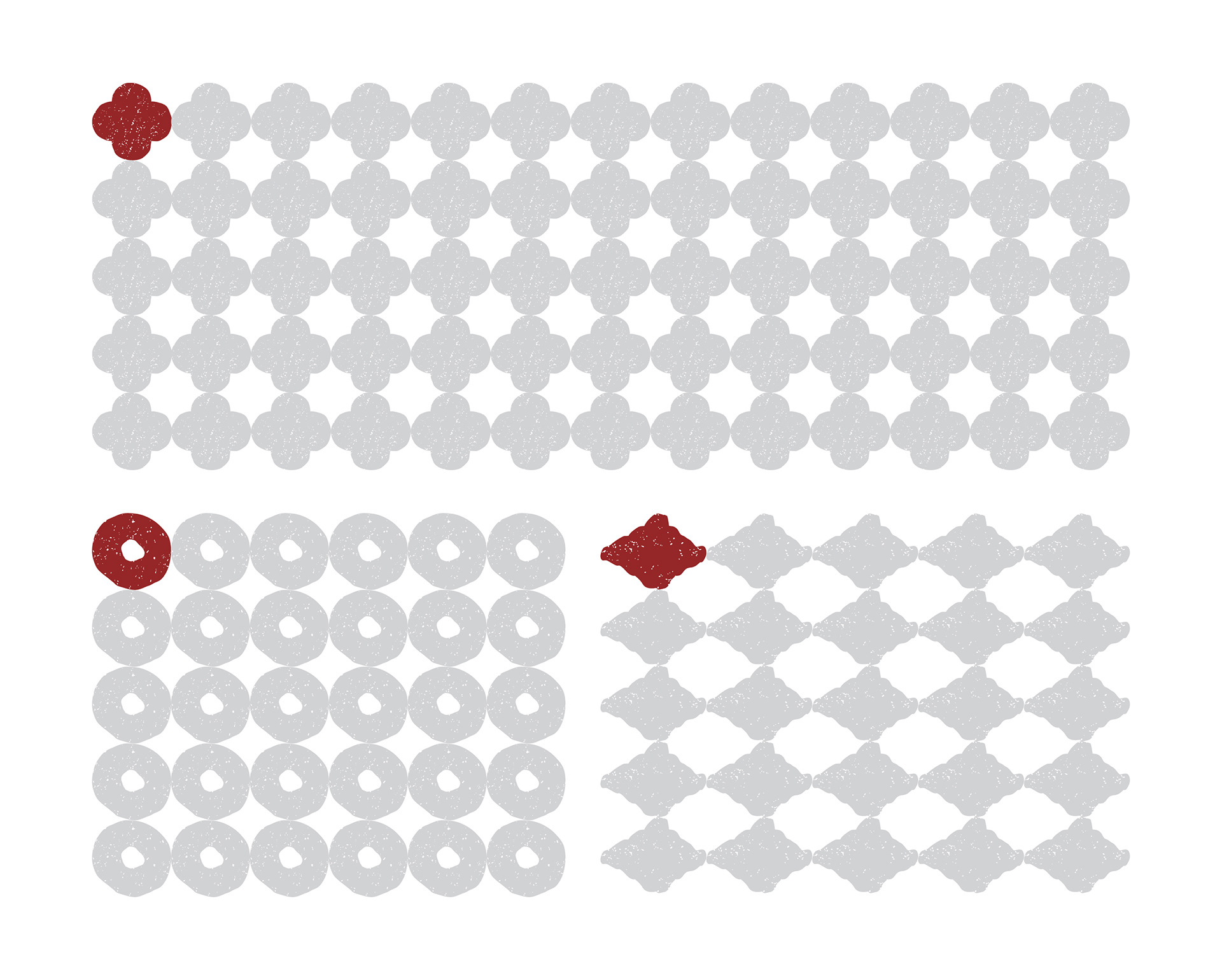
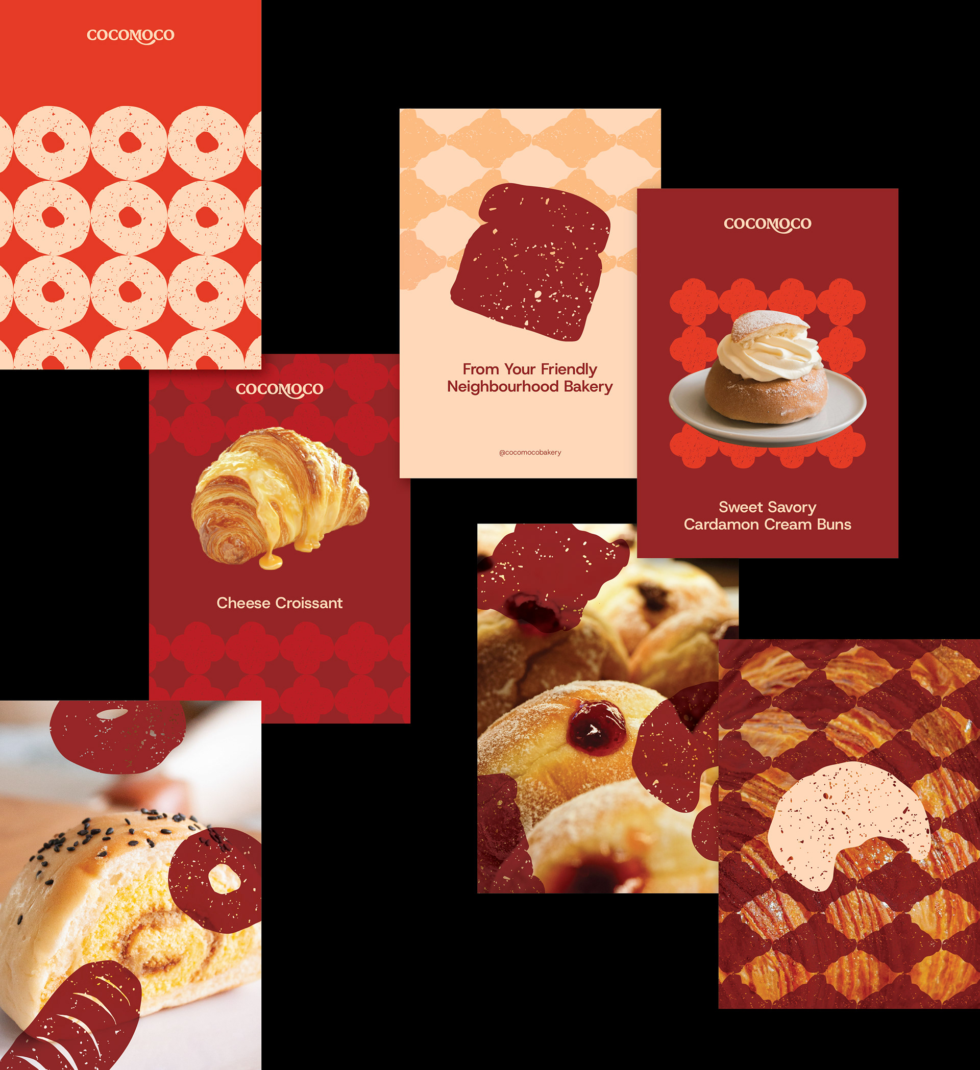
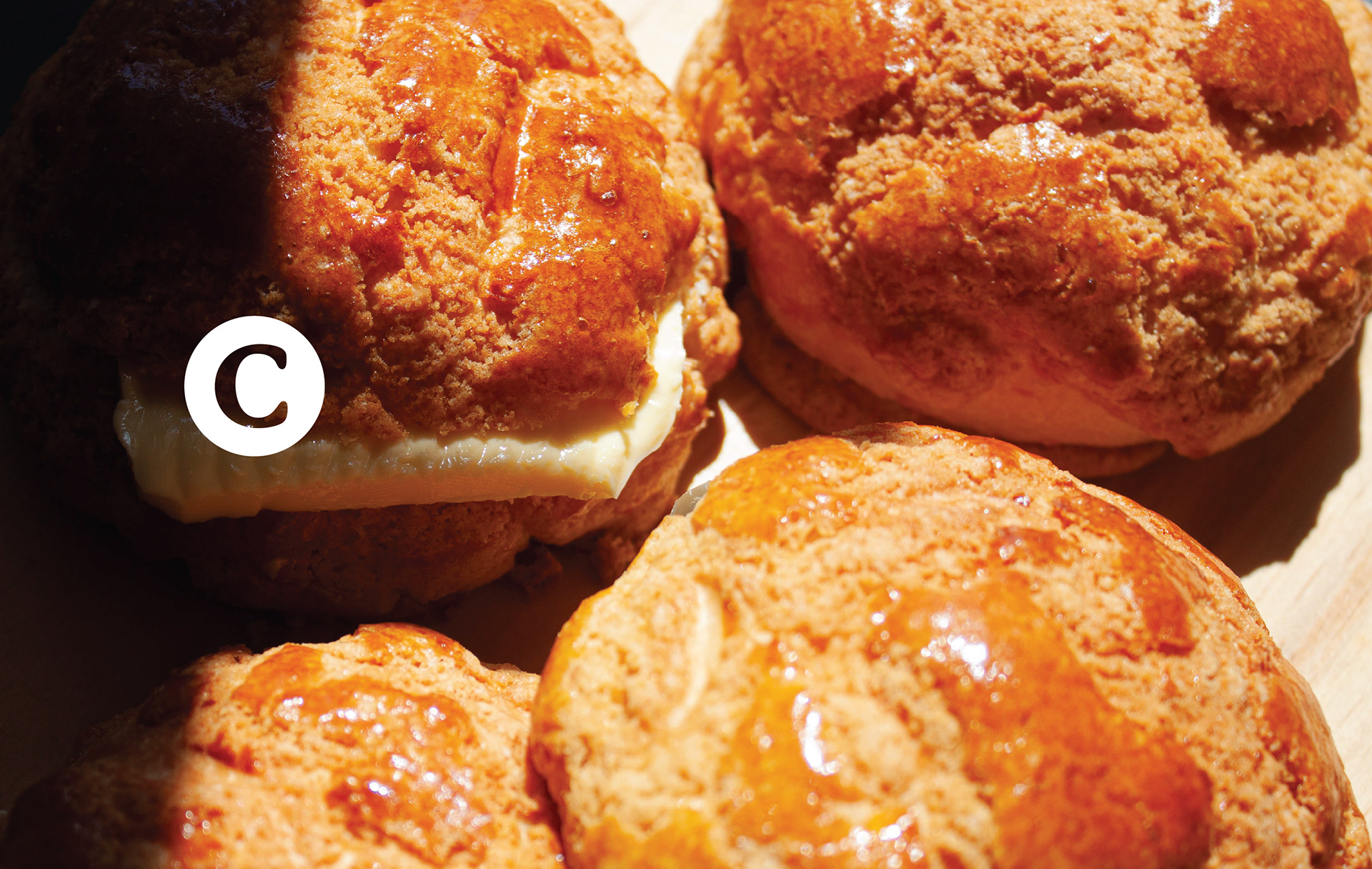
The pattern creates a distinctive visual language that expresses the essence of the brand without relying solely on the logo or typography. It serves as a supporting graphic element, helping create a cohesive and recognizable brand identity.
Graphic Merch
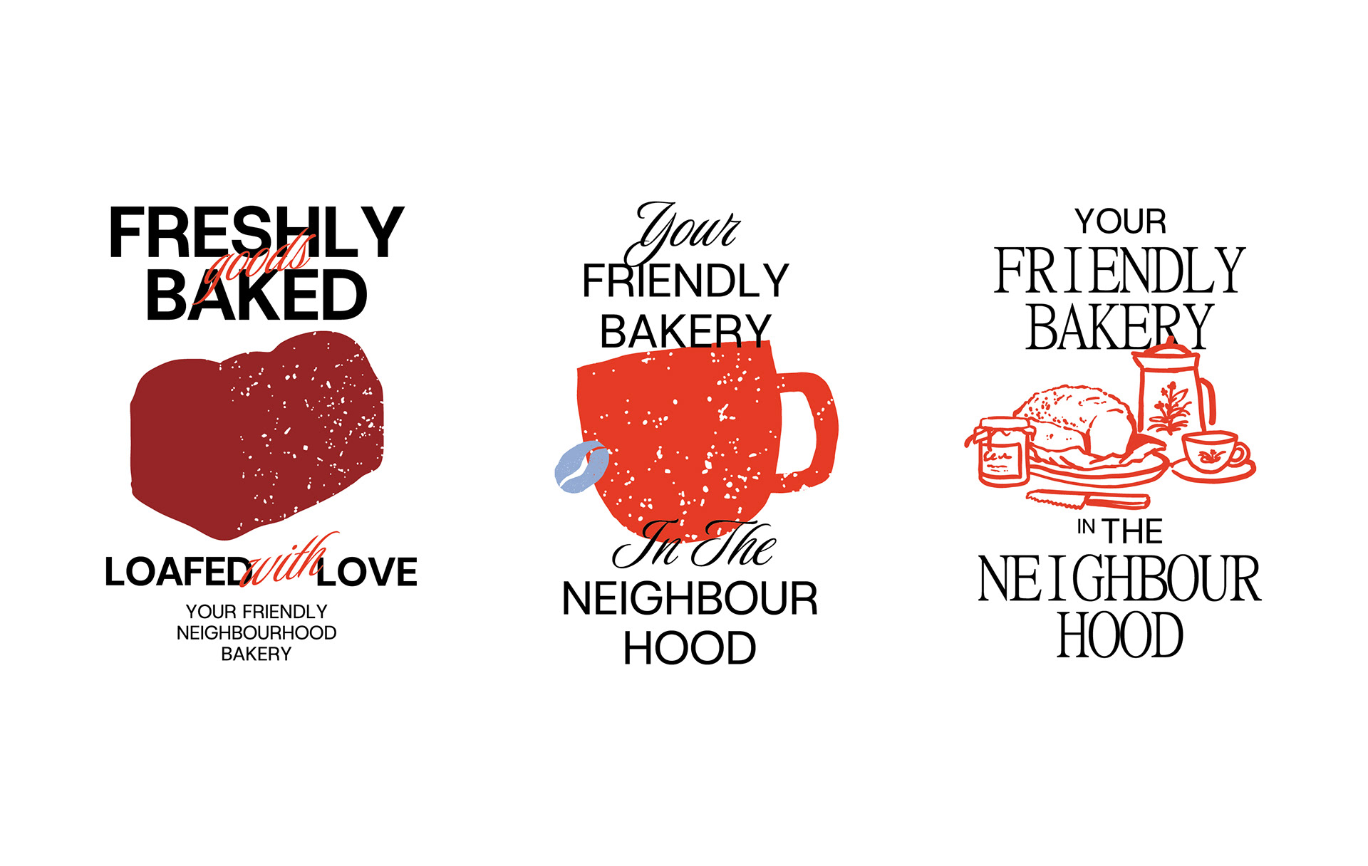
Multiple graphic T-shirt concepts were developed to expand Cocomoco's visual identity beyond the bakery itself. Rather than functioning solely as staff uniforms, the collection is designed as merchandise that customers can wear, turning the brand into a lifestyle expression.
Design /
Karina Salma
Septia Dwi P
Adji Herdanto
Logo Motion /
Achmad Hidayatullah
Design Director /
Adji Herdanto
Karina Salma
Septia Dwi P
Adji Herdanto
Logo Motion /
Achmad Hidayatullah
Design Director /
Adji Herdanto
Project Manager /
Anas Kautsar
Bread Images
Courtesy of Cocomoco